High Ways: Brand Identity Design
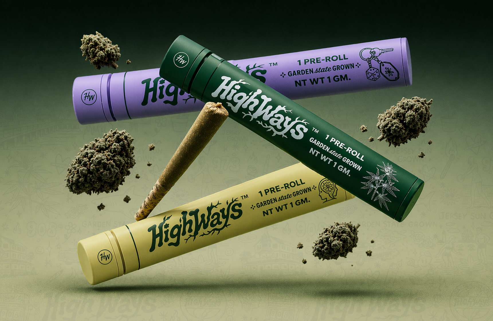
Visual Identity
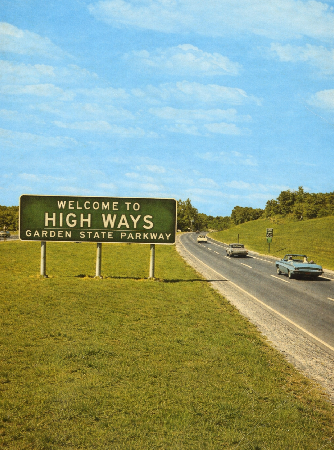
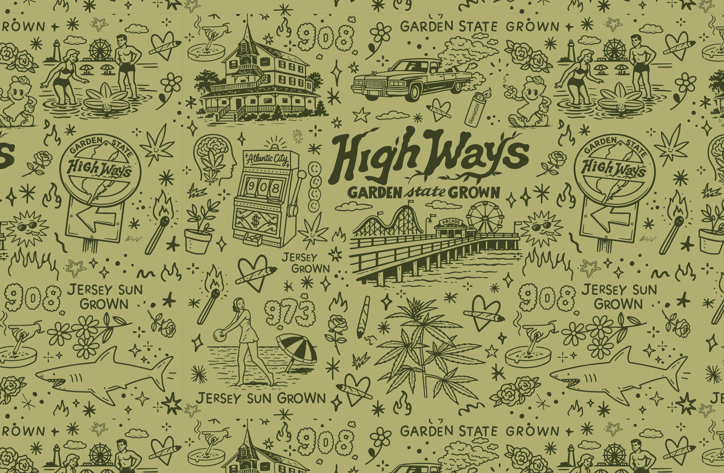
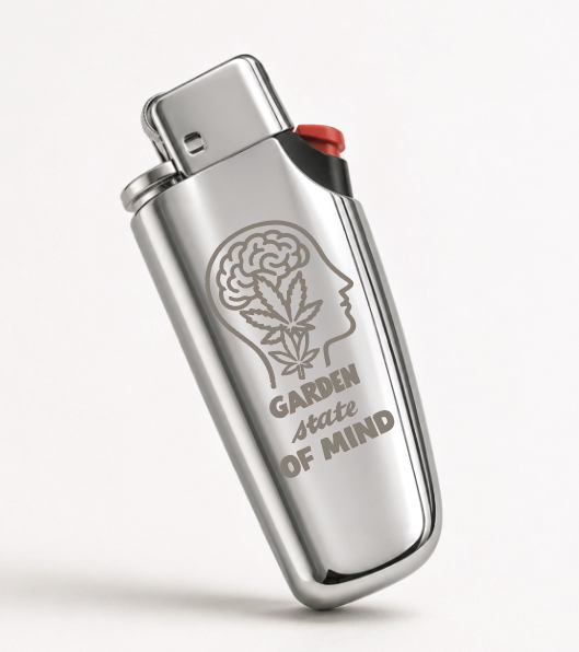
The visual identity for High Ways is rooted in pride of place, drawing inspiration from the energy, attitude, and unmistakable culture of New Jersey. Rather than leaning into the overly loud or gimmicky aesthetics common in cannabis, the identity finds a balance between elevated and playful. It feels considered without taking itself too seriously.
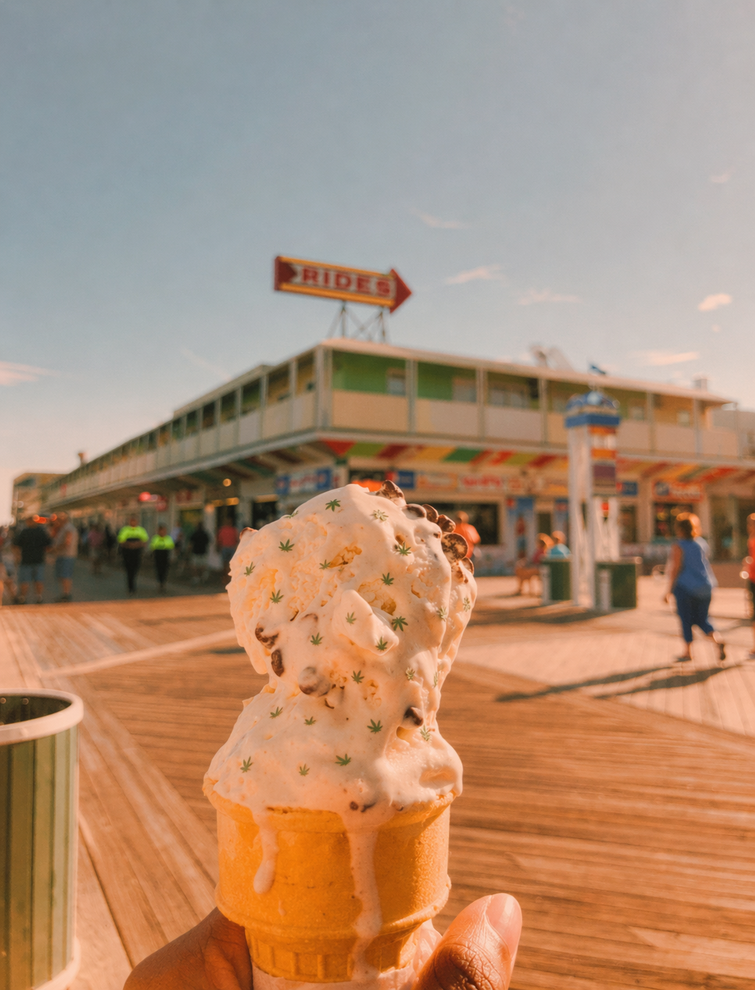
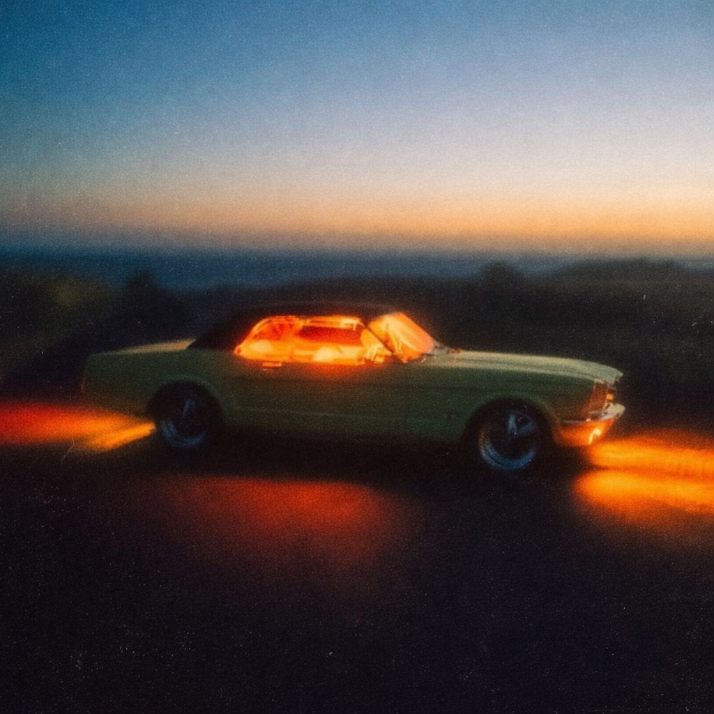
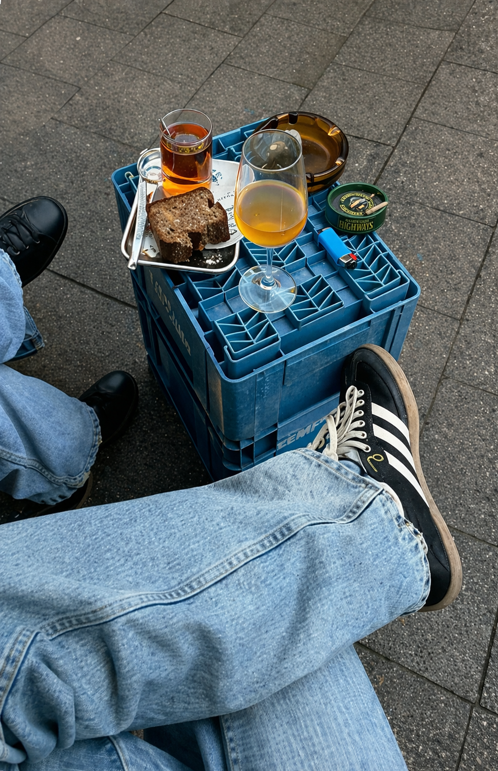
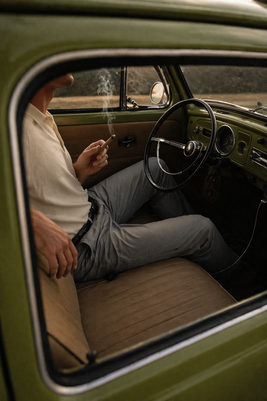
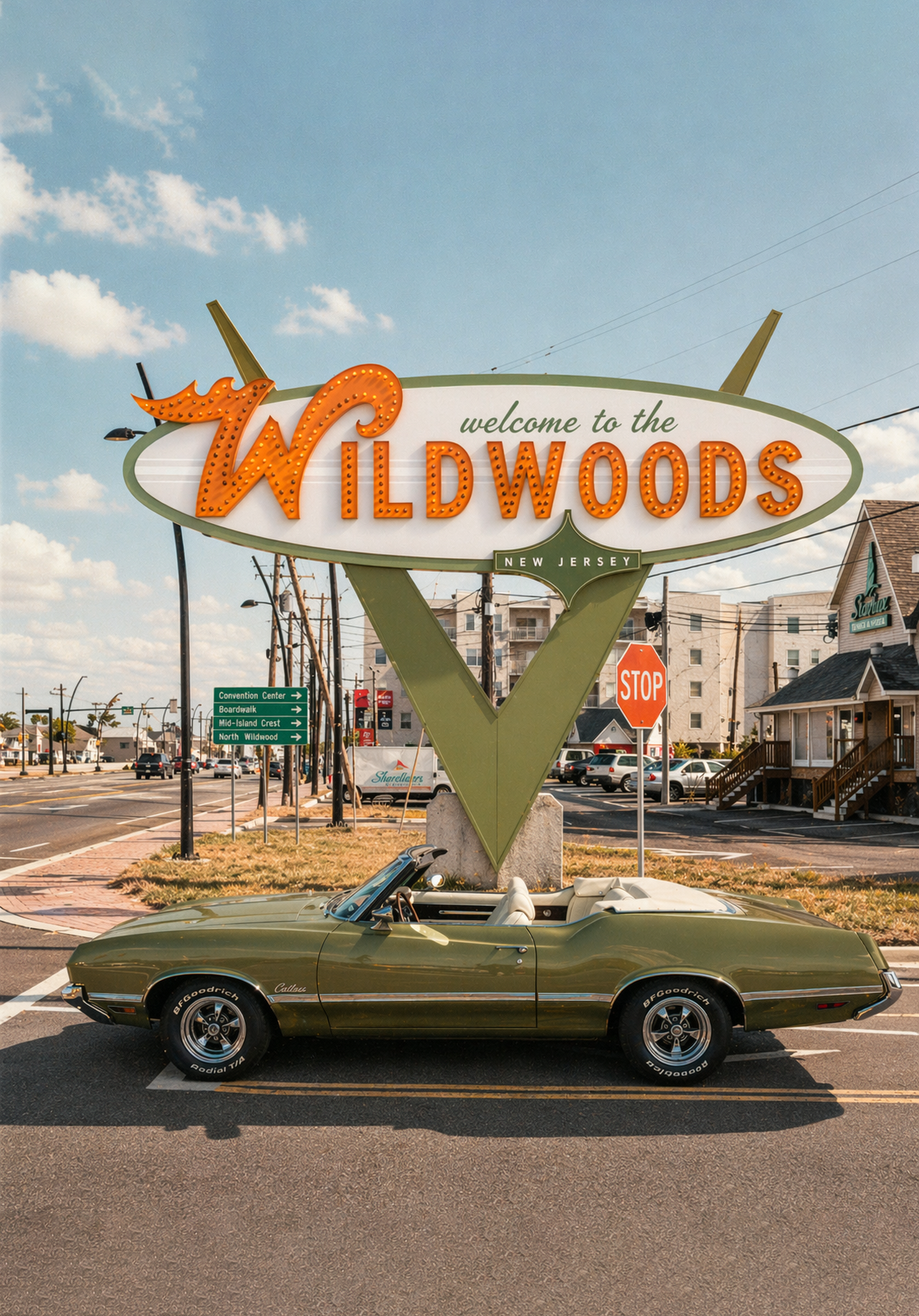
Bold typography, expressive graphics, and a vibrant visual language capture the feeling of a New Jersey summer: lively, nostalgic, a little irreverent, and full of personality. The result is a cannabis brand that feels credible and grown up while still being approachable, fun, and distinctly Jersey.
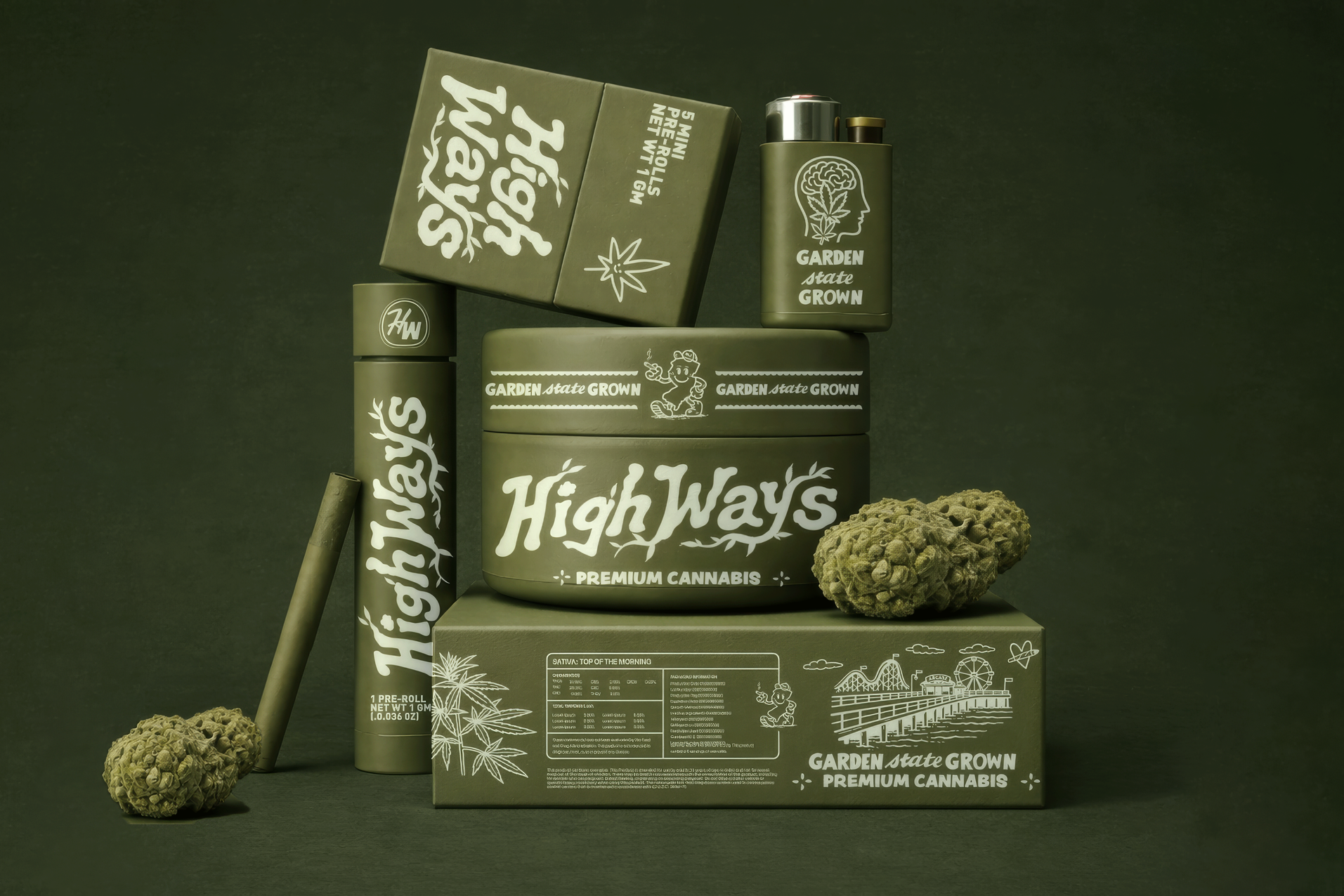
Logo & Branding
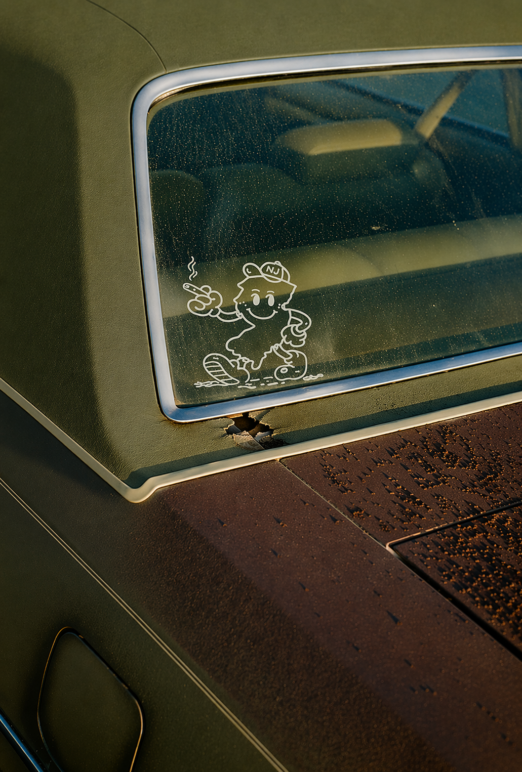
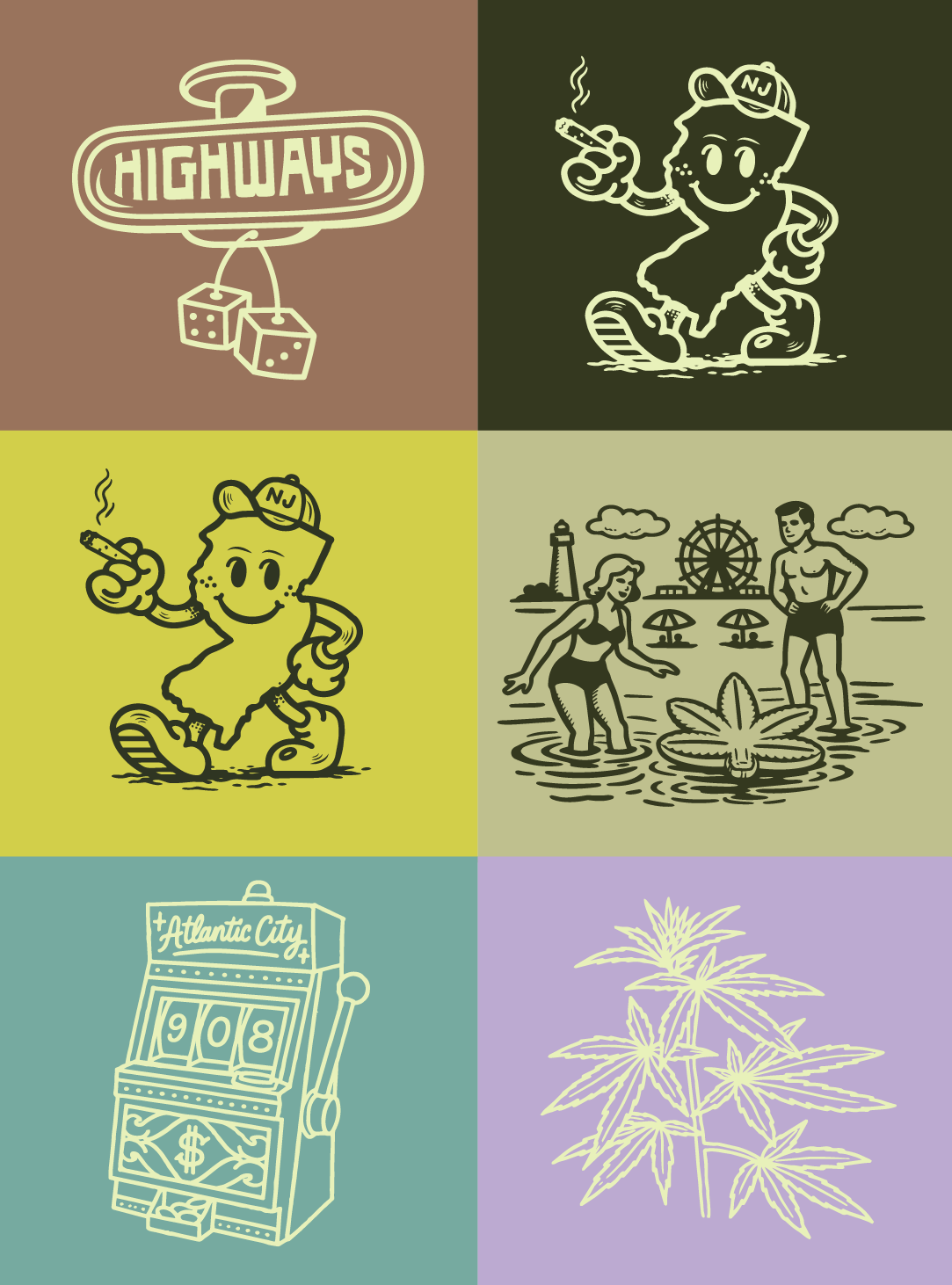
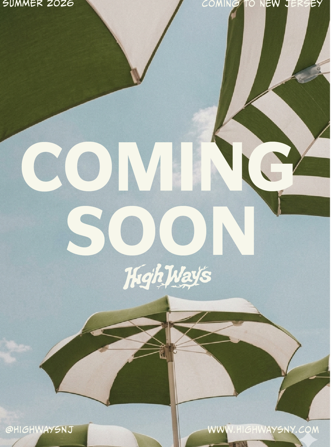
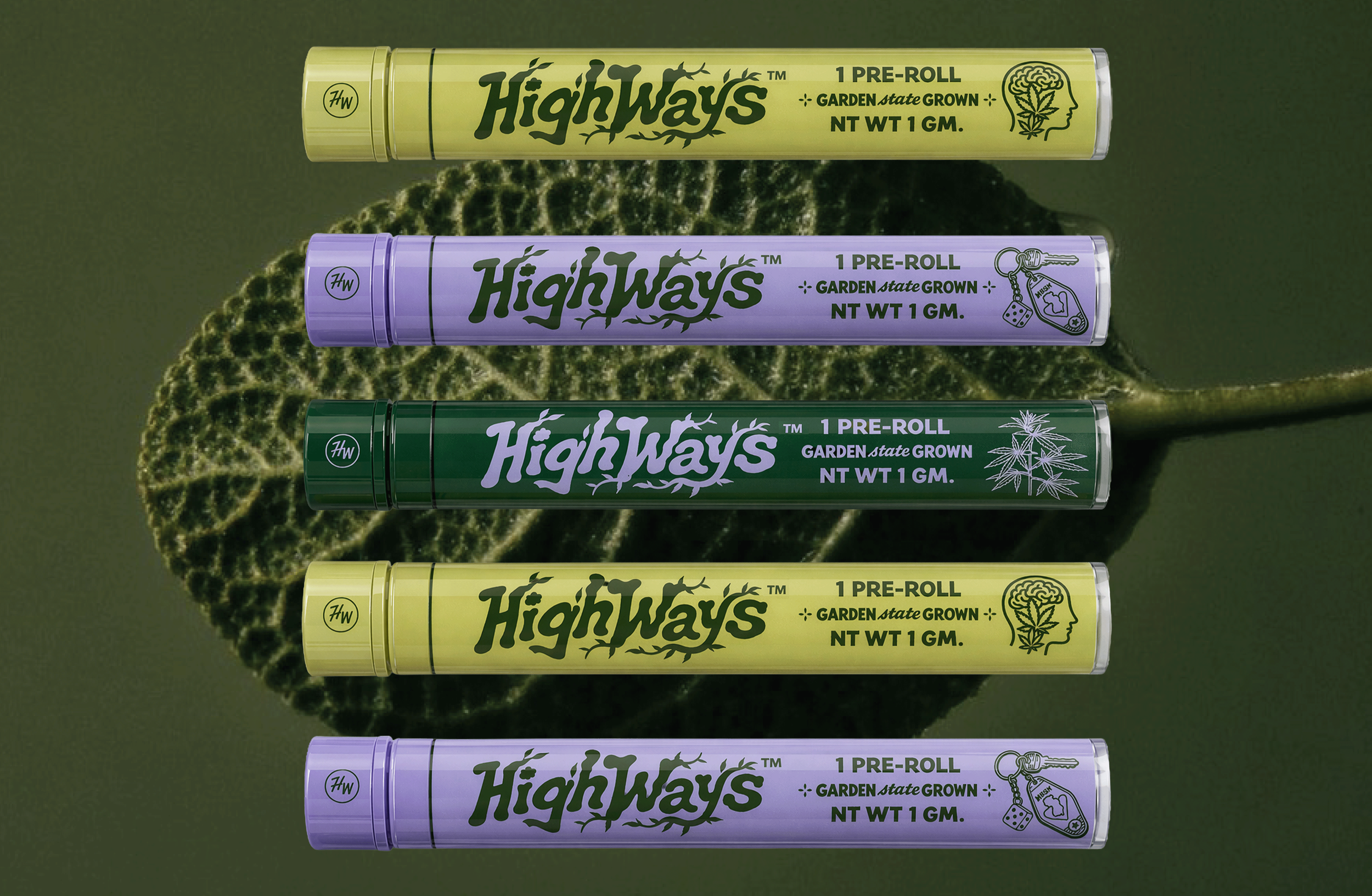
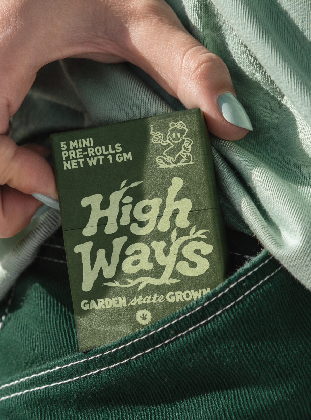
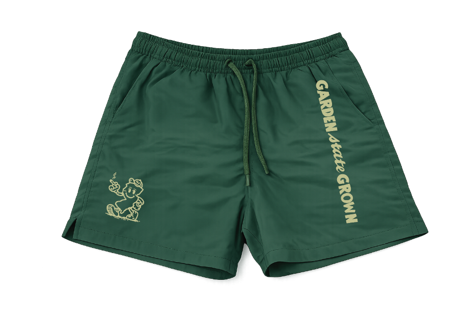
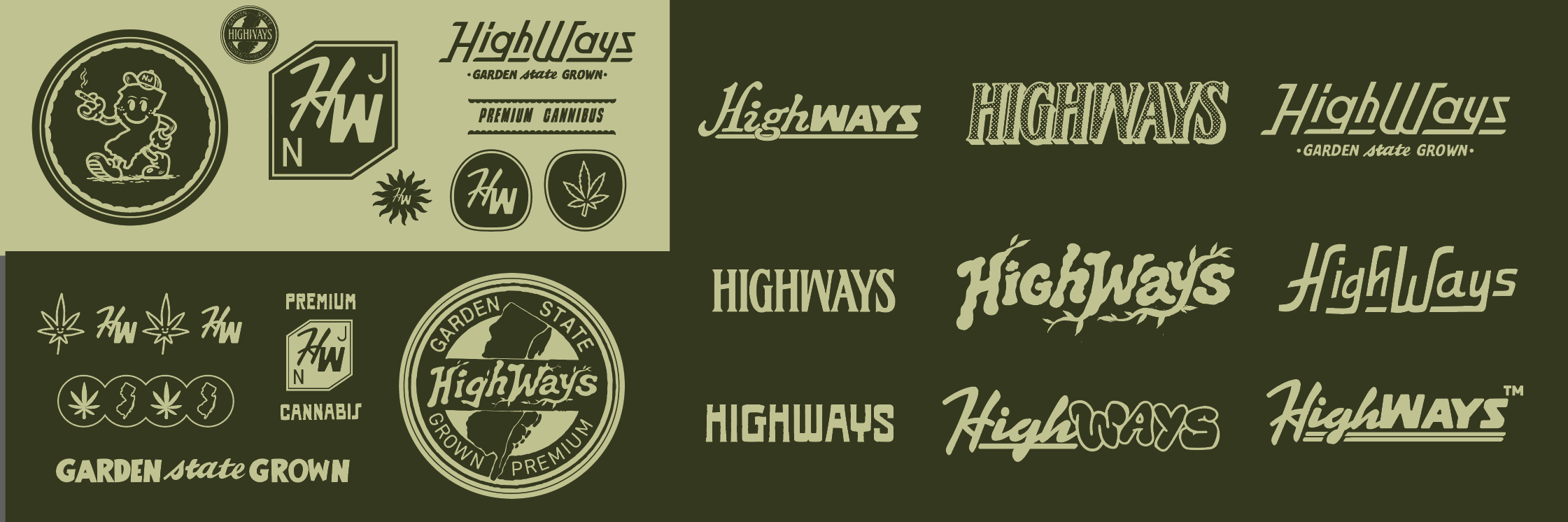
The High Ways identity blends a sense of nostalgia with the bold attitude of New Jersey. The custom logotype feels expressive and full of movement, giving the brand a personality that is playful without feeling unserious. A collection of badges, hand drawn marks, and Garden State references builds out the identity, pulling from vintage packaging, roadside graphics, and local iconography. Together, these elements create a system that feels familiar yet fresh, celebrating New Jersey with a little humor, confidence, and character
Social & Digital
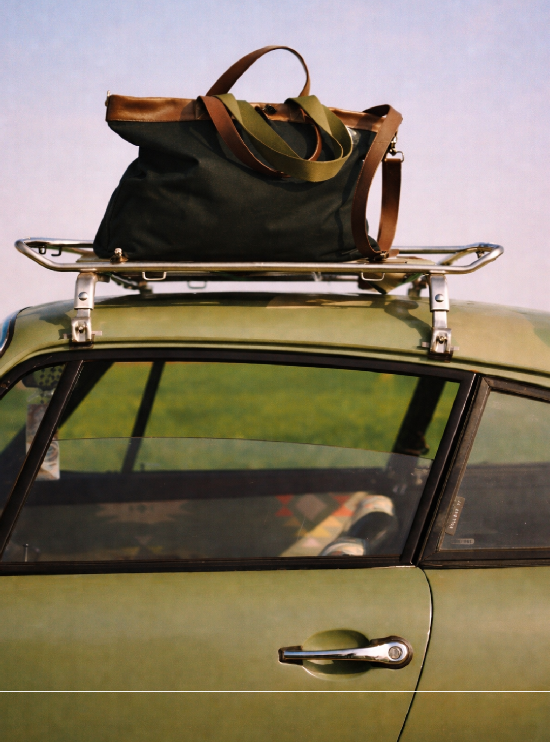
The social strategy and website extend the High Ways identity into a playful, lifestyle driven world rooted in the feeling of a New Jersey summer. Art direction combines nostalgic photography, surreal imagery, bold typography, and unexpected brand moments to make the product feel part of a larger culture rather than just another cannabis brand. Across social and digital, the system stays flexible and expressive while maintaining a consistent visual language that feels elevated, fun, and unmistakably High Ways.Logo & Branding